Gmail on the iPad and iPhone are two of the best mobile interfaces I have used. They are snappy, they allow me to do many things, and they look really good doing. These 2 older articles describe some of the innovations used in the iPad an iPhone/android user interfaces. For example they use the canvas tag to create the loading icon instead of downloading images. They also make extensive use of offline downloading. They also describe using CSS3 transforms to keep the floaty bar in place. These features not only look cool, but are used to speed everything up and make it more accessible offline. I'm really want to start playing with HTML5 Manifest (offline mode). Check out the two blog posts.
http://gmailblog.blogspot.com/2009/04/new-mobile-gmail-experience-for-iphone.html
http://gmailblog.blogspot.com/2010/04/gmail-on-ipad.html
Friday, May 28, 2010
Thursday, May 27, 2010
Developing Mobile Websites
Here are a few tips I've put together that I've found have helped me out with my mobile web design and development. I hope they'll help you too!
1) Use CakePhp's isMobile()
I usually use the CakePHP framework for doing programming and I check in the App Controller beforeFilter() function using $this->isMobile() is that's true I'll set a variable $this->mobile to true which I can check all over the place when trying to figure out which version of a page to return. Not to mention it's easy to forward them on to the correct domain name. It's lovely. Once they're in the correct domain name I will tell CakePHP to look in the m/ folder for files. This makes them easy to organize and find just what I need and makes for some wonderful MVC goodness. Something like this works well:
2) Don't re-use your huge CSS/JS files.
I always write a separate javascript and css file for mobile. Mobile will need it's own version of these files, usually I'll just call them mobile.css and mobile.js or something like that. They will be optimized for the mobile user experience and will likely be much smaller than the normal web javascript files.
3) Test! Test! Test!
Check using emulators and on real devices. You know, this has been difficult. webOS has an easy to use emulator. If you're on a mac you can quickly access the iPhone emulator by creating a new XCode project and running it in the simulator, then just click the home button and you can access and test in mobile safari. The Android emulator can be downloaded for free as well. Opera Mini can be downloaded easily on the Mac. That's 4 platforms right there. I'm still trying to figure out how to test on Blackberry devices. This site will also let you test your phone in some sweet old mobile web browsers:
http://mobiready.com/launch.jsp?locale=en_EN
4) Degrade graecfully.
If your site is built with simple tags like <img /> and <i> you shouldn't have much of a problem with older phones that can't handle images or css. Make sure to use the alt tag on the images and to be thoughtful about how content might appear in a texts based interface. Try to make sure your site will work fairly well without javascript as well. Though this can be a hard one if you want to do anything cool!
5) Keep it simple.
You know just because the iPhone and webOS can support "flashy" CSS3 animations doesn't mean that your site should. Those animations will likely be a little choppy and will ultimately make your site more difficult to use. Not to mention that they won't be supported by every phone. Just leave them out or keep them for your desktop/iPad-ready website.
6) Avoid Phone Specific Code
Avoid phone specific code. This is so hard to maintain. I caught myself throwing in a little if (ua.match(/webos/)) { the other day and quickly stopped myself. There are usually ways around doing phone specific code and whenever possible avoid doing it!
7) Pick your platforms.
It's impossible to support every platform perfectly. Decide right now which phones you want to support fully and then do all you can to ensure that those do work perfectly. You need to choose where to spend your time. If you know that all of your customers use the iPhone, then just optimize for that, it's not worth the resources it takes to optimize for everything else.
8) Don't use WAP.
WAP is difficult to use. It requires special headers. It's barely supported by anything anymore. It doesn't really support normal images and it's pretty much completely useless. Instead stick to basic HTML5 tags that will be supported in most phones. No, I do not have a complete list, but the simpler the better.
9) Avoid tables.
Tables are a clunky way to design sites and really won't help you very much when targeting smaller phones. You should avoid them anyway for normal web development. You are best to stick with lists, which are much more flexible.
10) Avoid Javascript
At least make sure your site works without javascript. Javascript is such a helpful tool, but it will not be supported on a lot of older phones. If you want to create a universal mobile experience see what you can without javascript first. If you can get the core functionality in there without it then you can add additional features for those phones that do support it later.
Those are my tips and tricks. Hope they have been helpful. Here are some other great resources I have found for mobile web development and design:
Tutorials
http://articles.sitepoint.com/article/designing-for-mobile-web - Decent article on building a mobile website for sort of the previous generation of mobile phones (2008)
http://www.smashingmagazine.com/2009/01/13/mobile-web-design-trends-2009/ - Discusses the trends coming along in early 2009 about designing for the mobile web. Again, this mostly is about support previous generation phones.
http://www.elementfusion.com/tutorial-optimizing-your-website-for-mobile-devices - Excellent tutorial for creating a beautiful website that displays on some of the newer phones.
http://mobiforge.com/designing/story/effective-design-multiple-screen-sizes - In depth research about mobile design and development from mobiforge!
1) Use CakePhp's isMobile()
I usually use the CakePHP framework for doing programming and I check in the App Controller beforeFilter() function using $this->isMobile() is that's true I'll set a variable $this->mobile to true which I can check all over the place when trying to figure out which version of a page to return. Not to mention it's easy to forward them on to the correct domain name. It's lovely. Once they're in the correct domain name I will tell CakePHP to look in the m/ folder for files. This makes them easy to organize and find just what I need and makes for some wonderful MVC goodness. Something like this works well:
if (preg_match('/^m\./i',$_SERVER['HTTP_HOST'])) {
$this->layoutPath .= "/m";
$this->viewPath .= "/m";
$this->mobile = true;
} elseif ($this->RequestHandler->isMobile()) {
$this->redirect("http://m.mysite.com");
}
$this->layoutPath .= "/m";
$this->viewPath .= "/m";
$this->mobile = true;
} elseif ($this->RequestHandler->isMobile()) {
$this->redirect("http://m.mysite.com");
}
2) Don't re-use your huge CSS/JS files.
I always write a separate javascript and css file for mobile. Mobile will need it's own version of these files, usually I'll just call them mobile.css and mobile.js or something like that. They will be optimized for the mobile user experience and will likely be much smaller than the normal web javascript files.
3) Test! Test! Test!
Check using emulators and on real devices. You know, this has been difficult. webOS has an easy to use emulator. If you're on a mac you can quickly access the iPhone emulator by creating a new XCode project and running it in the simulator, then just click the home button and you can access and test in mobile safari. The Android emulator can be downloaded for free as well. Opera Mini can be downloaded easily on the Mac. That's 4 platforms right there. I'm still trying to figure out how to test on Blackberry devices. This site will also let you test your phone in some sweet old mobile web browsers:
http://mobiready.com/launch.jsp?locale=en_EN
4) Degrade graecfully.
If your site is built with simple tags like <img /> and <i> you shouldn't have much of a problem with older phones that can't handle images or css. Make sure to use the alt tag on the images and to be thoughtful about how content might appear in a texts based interface. Try to make sure your site will work fairly well without javascript as well. Though this can be a hard one if you want to do anything cool!
5) Keep it simple.
You know just because the iPhone and webOS can support "flashy" CSS3 animations doesn't mean that your site should. Those animations will likely be a little choppy and will ultimately make your site more difficult to use. Not to mention that they won't be supported by every phone. Just leave them out or keep them for your desktop/iPad-ready website.
6) Avoid Phone Specific Code
Avoid phone specific code. This is so hard to maintain. I caught myself throwing in a little if (ua.match(/webos/)) { the other day and quickly stopped myself. There are usually ways around doing phone specific code and whenever possible avoid doing it!
7) Pick your platforms.
It's impossible to support every platform perfectly. Decide right now which phones you want to support fully and then do all you can to ensure that those do work perfectly. You need to choose where to spend your time. If you know that all of your customers use the iPhone, then just optimize for that, it's not worth the resources it takes to optimize for everything else.
8) Don't use WAP.
WAP is difficult to use. It requires special headers. It's barely supported by anything anymore. It doesn't really support normal images and it's pretty much completely useless. Instead stick to basic HTML5 tags that will be supported in most phones. No, I do not have a complete list, but the simpler the better.
9) Avoid tables.
Tables are a clunky way to design sites and really won't help you very much when targeting smaller phones. You should avoid them anyway for normal web development. You are best to stick with lists, which are much more flexible.
10) Avoid Javascript
At least make sure your site works without javascript. Javascript is such a helpful tool, but it will not be supported on a lot of older phones. If you want to create a universal mobile experience see what you can without javascript first. If you can get the core functionality in there without it then you can add additional features for those phones that do support it later.
Those are my tips and tricks. Hope they have been helpful. Here are some other great resources I have found for mobile web development and design:
Tutorials
http://articles.sitepoint.com/article/designing-for-mobile-web - Decent article on building a mobile website for sort of the previous generation of mobile phones (2008)
http://www.smashingmagazine.com/2009/01/13/mobile-web-design-trends-2009/ - Discusses the trends coming along in early 2009 about designing for the mobile web. Again, this mostly is about support previous generation phones.
http://www.elementfusion.com/tutorial-optimizing-your-website-for-mobile-devices - Excellent tutorial for creating a beautiful website that displays on some of the newer phones.
http://mobiforge.com/designing/story/effective-design-multiple-screen-sizes - In depth research about mobile design and development from mobiforge!
Wednesday, May 26, 2010
Palm WebOS and jQuery headaches
Having a horrendous time trying to do mobile web development and supporting Opera Mobile, Palm webOS, Android, and iPhone.
Right now my favorite of the bunch is generally webOS. I really want a Palm Pre after developer on there for a little while. It's amazing platform based on HTML5 and Javascript. The emulator generally works really well too, but today I ran into two problems.
1) jQuery stopped working? I'm not sure what happened here, but I have a picture of a demo on jQuery.com and the browser just grayed out the whole thing. After hanging out in #jquery and #webos in irc.freednode.net I found out that the problem doesn't exist (for anyone else at least). I restarted my emulator and then it started working again. Annoying, huh?
2) This one might not be an emulator issue. I'm using jQuery.load to pull in some new webpages and of all of the platforms above this appears to the only one that cannot handle scripts being added to the dom dynamically, which is how .load() pulls in scripts. Instead of having the javascript source file linked from the ajax-loaded page, I re-wrote the script to use jQuery.live and watch for the events throughout the entire app's existence. A bit of a pain, but not too hard. I still don't know if this is a "feature" of webOS or if I just did something wrong. Any thoughts?
jQuery.load() reference:
http://api.jquery.com/load/
Monday, May 24, 2010
Palm WebOS
Today I have been playing with the Palm webOS simulator. It's been a joy to work with and I think developing for this platform would be really fun! I am happy to hear it's not dying after HP's acquisition of Palm. Here a few links that can you help you explore this cool platform / OS.
http://www.slideshare.net/fpatton/marinacci-josh-intro-to-web-os-palm-dev-day - Great overview of the features and capabilities of WebOS
http://developer.palm.com/index.php?option=com_content&view=article&id=1574 - Basic Web Programming Guide for WebOS by Palm
http://developer.palm.com/index.php?option=com_content&view=article&id=1788&Itemid=55 - Download the SDK!
http://developer.palm.com/index.php?option=com_content&view=article&id=1603&Itemid=43 - webOS application programming basics
http://developer.palm.com/index.php?option=com_content&view=article&id=1744&Itemid=58#Emulator-KeyboardShortcutsEmulator - Keyboard Shortcuts are critical because the emulator doesn't have any buttons!
Good luck to all of you future webOS developers out there!
Mobile App Store Lessons
I really found this article interesting. Its reports from a round table with business leaders about successes and failures to do with app store pricing:
http://gigaom.com/2010/05/19/never-charge-for-a-mobile-app-and-other-freemium-lessons-from-vcs/
To sum it up, basically they said that you should give your apps away for free and then sell upgrades. Make sure your audience is big enough to make money off a 2-3% upgrade margin. Worth reading though for many other tidbits of info.
Saturday, May 22, 2010
Fishes iPhone App

I have made a lot of improvements to my app including levels, colorful fish and a counter. You can also pause and restart gameplay.
The source code is below:
http://www.jamund.com/fishes-iphone/fishes.zip
And here is a mobile HTML5 version of the game with an uglier shark:
CSS3 Scaling vs. Changing the width and height of
Again for that PhoneGap iPad app I was previously working on the last CSS3 trick I used seemed to work well, however another CSS3 trick I used scale() failed miserably!
$("img").css({webkitTransform: 'scale(2)'}); // this actually makes thing bigger
Combined with the transition above it actually looked pretty, however.......When trying to pan the image around I kept having problems. The problems weren't while moving the image. That was fine it was when I stopped and started again it would jerk pretty far in the opposite direction. I still don't know this would happen, so I went back to a non CSS3 zoom and it seems fine. More investigation is needed to understand why working with a scaled image was so much more difficult than working with a resized image. Final solution (it even uses the CSS3 transition above):
$("img").each(function() {
$(this).css({height: "auto",width: $(this).width()*2});
});
This may have just been a bug with the jQuery Touch plugin I was using, but I couldn't get it working in the time it needed to work, so I had to just move on. Sadness.
iPad I know you can do better!
HTML5 Fish Game
My First Open-Source Project:
https://code.google.com/p/html5fish/
Normal version:
http://www.jamund.com/fishes/
https://code.google.com/p/html5fish/
Normal version:
http://www.jamund.com/fishes/
setTimeout() vs setInterval() reprise
I put together a basic link that will let you set the interval time and compare against setTimeout() and setInterval(). Right now in Firefox I can't get either of them to go above 14. It's probably something I'm doing in my code. You let me know:
http://www.jamund.com/timers/
Code is also here:
http://pastium.org/view/5b5904aad004858f5a4c0a2604096850
http://www.jamund.com/timers/
Code is also here:
http://pastium.org/view/5b5904aad004858f5a4c0a2604096850
Rotating Images on A Canvas

I was having some humongous trouble getting the canvas to rotate properly in the following example. I wanted actors to move around the stage in a meaningful way. I've learned that to get the actors to move you can draw the images in different places or you can save the canvas, translate the canvas, draw the image to the screen and then reset the canvas. This will effectively move around the image. I don't know which way is faster. The following code snippet uses the latter method. In order to get the actors to rotate you have to save the canvas, rotate the canvas, draw the image and then reset the canvas. Well this will do some funny things because you are not rotating the canvas where the actor is, you are rotating (by default) from the center. So what you have to do is something like this:
Actor.prototype.draw = function() {
   if (this.image.isReady) {
    context.save();
    context.translate(this.dx, this.dy);
    context.scale(this.scaleVal,this.scaleVal);
    var rotateX = this.x+this.width/2;
    var rotateY = this.y+this.height/2;
    context.translate(rotateX, rotateY);
     context.rotate(this.angle);
    context.translate(-rotateX, -rotateY);
    context.drawImage(this.image, this.x, this.y, this.width, this.height);
    context.restore();
   }
  }
I will be posting a demo soon!
HTML: http://pastium.org/view/fcc862b3fa944ee07c42917bfccb1ab1
JS: http://pastium.org/view/554ce8888f33b03eb307d11562922ccd
CSS: http://pastium.org/view/c7e2f8eae3c30ef0178d5825be350956
The real key to make this happen though was this simple code posted by caleb_h at irc.freenode.net!:
http://erxz.com/pb/25522
Friday, May 21, 2010
HTML4 vs. Canvas vs. SVG vs. Flash Benchmark
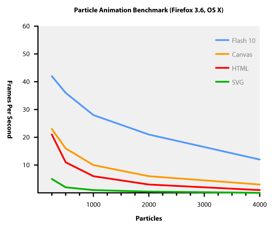
Looks like if you're going for HTML5 animations canvas is the way go. Interesting! Might comment more on this later or post my own benchmarks. Thanks to themaininblue.com for this cool write-up.
Click here for demos and more information about the methods used:
http://www.themaninblue.com/writing/perspective/2010/03/22/
setTimeout vs setInterval
setTimeout() is apparently WAY faster than using setInterval()
In Firefox I'm getting a limit of 14 FPS using setInterval(), but with setTimeout() my frame rate is 88 FPS!
Code example here:
In Firefox I'm getting a limit of 14 FPS using setInterval(), but with setTimeout() my frame rate is 88 FPS!
Code example here:
 var fps;
 var startTime;
 var diffTime;
 var rate = 10;
 var frames = 0;

 function countTimeRecursive() {
  time  = new Date().getTime();
  diffTime = (time - startTime);
  frames++;
  if (diffTime >= 1000) {
   fps.textContent = "FPS: " + frames;
   frames = 0;
   diffTime = 0;
   startTime = time;
  }
  setTimeout('countTimeRecursive()', rate);
 }

 function countTime() {
  time  = new Date().getTime();
  diffTime += (time - startTime);
  frames++;
  if (diffTime >= 1000) {
   fps.textContent = "FPS: " + frames;
   frames = 0;
   diffTime = 0;
   startTime = time;
  }
 }

 function countInterval() {
  setInterval('countTime()', rate);
 }

 window.onload = function() {
  // print and move them around
  // countTimeRecursive()
  countTimeRecursive();
  fps = document.getElementById('fps');
  startTime = new Date().getTime();
  diffTime = 0;
 }
Thursday, May 20, 2010
Tracking the FPS of a Canvas Animation
I wanted to see how I was doing with FPS on the fish game. So here's how we get at that.
P.s. don't try this at home
And the final result:
http://jamund.com/fishes.html
// at the top somewhere
var diffTime=0;
var frames=0;
var startTime = new Date().getTime();
setInterval('doAnimation', 100);

function doAnimation() {
// get the timestamp
   time  = new Date().getTime();
   diffTime += (time - startTime);
   frames++;
   if (diffTime >= 1000) {
    $("#fps").text("FPS: " + frames);
    frames = 0;
    diffTime = 0;
    startTime = time;
   }
   // animation code
}
P.s. don't try this at home
while (true) {
    countTime();
   }
And the final result:
http://jamund.com/fishes.html
Wednesday, May 19, 2010
Ad-Hoc iPad Deployment in Xcode 3.2.2 using PhoneGap
I had some severe problems trying to setup an iPad app I built using PhoneGap in XCode 3.2.2 for Ad-Hoc deployment. I primarily followed the instructions from the apple website here:
http://developer.apple.com/iphone/manage/distribution/index.action
The problem I had was that in project properties there was no option to set an Entitlements file. This is usually found in Project Settings under the Code Signing heading with the title "Code Signing Entitlements". This is not under project settings when creating a new PhoneGap project in XCode, but does exist when creating a new iPad XCode project.
In order to get Ad-Hoc provisioning to work you will need to go to the project settings menu. In the bottom left hand corner click on the icon and select "Add User-Defined Setting". For the title you will need to use "CODE_SIGN_ENTITLEMENTS" and for the value "Entitlements.plist".
Once you have done this you can follow the instructions from Apple just fine.
http://www.phonegap.com
http://developer.apple.com
Monday, May 17, 2010
Projects I'd love to work on
1)Mobile App Front-end Framework (iPhone, Android, PalmOS, etc)
2)HTML5 2D game framework
3)JQuery CSS3 Effects Plugin
4)Touch-sceeen interactive displays using objective-C??
5)Top Secret iPhone game
2)HTML5 2D game framework
3)JQuery CSS3 Effects Plugin
4)Touch-sceeen interactive displays using objective-C??
5)Top Secret iPhone game
iPad Icon Size
Icon-72.png 72x72 pixels (this is for the iPad itself)
Icon.png 57x57 pixels (this is the standard for the Iphone)
More information can be found here:
'http://developer.apple.com/iphone/library/documentation/userexperience/conceptual/mobilehig/IconsImages/IconsImages.html
http://developer.apple.com/iphone/library/documentation/General/Conceptual/iPadHIG/DesignGuidelines/DesignGuidelines.html
http://developer.apple.com/iphone/library/qa/qa2010/qa1686.html
Friday, May 14, 2010
PhoneGap iPad Large Image Problems
The Problem:
I'm loading between 6-10 1-2 MB images in a page on PhoneGap. The view is essentially an image slider that you zoom into. It works fine in a browser, so I figured there would be no problem in an app. Boy was I wrong. (Also, I later checked and even in the ipad web browser it seems pretty bad).
Usually the first few images work fine and then after that they randomly work or don't work. It's very intermittent and no memory errors appear. These are images that I am loading locally. I found this very troubling at first, and it took me a while to figure out what to do.
My first thought:
Pre-loading
If I pre-loaded the images they would be ready to render at a moments notice. I tried some various pre-loading techniques people have suggested with jQuery and none seemed to work. Obviously putting more things in memory isn't going to help if it's a memory problem.
The second attempt:
Lazy-Loading
I start with all of the images unloaded (set to a low res placeholder).
<img src="grey.gif" alt="real_image.jpg" />
As they image come is approaching the screen I load it up:
var el = $("img.next");
el.attr("src", el.attr("alt")+"");
This seems to work better but with the side effect that sometimes the next image isn't loaded before it starts coming into view. And then as I carry on it still has the problem of not all of the information working properly. #fail
The third and final solution:
Lazy-loading and Pre-loading and Post-unloading
I have to lazy load the images and then UNLOAD the unused images by setting their src to a place holder image.
In order to make this work smoothly I'm using opacity and CSS3 transitions:
The CSS:
img {
-webkit-transition: all 1.5s ease-in;
}
The JS:
$("#img2").css({zIndex:1,left:0,top:0}); // put the second picture in place
$("#img1").css({zIndex:2,opacity:0}); // first image will slowly fade out
Thanks for listening.
Jamund
smooth scroll to using css3
I'm currently trying to figure out how to do smooth horizontal scrolling on an iPad using CSS3. I first tried using the jQuery.animate() function to move the scrollLeft paramater, but it kind of sucks and is "chuggy" on the iPad. However the jQuery easing plugin might help this a little bit. Still working on a solution for this one.......ended up just doing a fadeIn / fadeOut kind of thing. I was a little disappointed with the iPad for this one. Will I be able to use translateX for this sort of thing? Any ideas? Anyone?
Thursday, May 13, 2010
Cross-Domain AJAX with Jquery and JSONP
I've had a heck of a time recently doing some cross-domain ajax scripting with json. This is for an iPhone website and it's basic HTML (no PHP) and it needs to access some data from a specific website. At first we tried JQuery.post, but to no avail.
Eventually we realized that we would need to use JSONP. JSONP requires you to do things on the client side as well as the server side. We use CakePHP here at rain, so you will see that in the server code.
On the client side, as far as I can tell, POST is not an option, so use .getJSON instead
This is the client side code:
var data = $("form").serialize();
$.getJSON("http://mytest.url.com/services/server?callback=?", data, function(data) {
alert(data);
});
Here is the server side:
echo $this->params['url']['callback'] . '(' . json_encode($data) . ');';
Two helpful articles on the subject:
http://remysharp.com/2007/10/08/what-is-jsonp/
http://www.markhneedham.com/blog/2009/08/27/jquery-post-jsonp-and-cross-domain-requests/
Wednesday, May 12, 2010
Using jQuery for iPhone/iPad pinch zoom gestures
I'm trying to get jQuery to work for doing some gesturechange and gesturestart events. It seems to work well at capturing the events but the supposed e.zoom property is not there! This is endlessly frustrating. Wish I could figure out how to enable the dev console while doing apps in PhoneGap! I'm trying to use this print_r / var_dump equivalent for javascript, so far with mixed results:
http://scriptnode.com/article/javascript-print_r-or-var_dump-equivalent/
See the Apple tutorial here:
http://developer.apple.com/safari/library/documentation/InternetWeb/Conceptual/SafariVisualEffectsProgGuide/InteractiveVisualEffects/InteractiveVisualEffects.html
http://scriptnode.com/article/javascript-print_r-or-var_dump-equivalent/
See the Apple tutorial here:
http://developer.apple.com/safari/library/documentation/InternetWeb/Conceptual/SafariVisualEffectsProgGuide/InteractiveVisualEffects/InteractiveVisualEffects.html
Tuesday, May 4, 2010
iPhone Touch Events
Dear Apple,
This is one area that is fairly poorly documented.
In javascript with mobile safari I want to capture the mousemove event on a canvas object. It works fine in normal browsers and I'm using the technique on top here to do it in Firefox, but mobile safari won't let you use mousemove in the same way.
Mobile safari actually provides and even better event for you to use. It's called touchmove. Touch move already knows if your finger is on the screen so you don't have to check for that in your callback function. The code below replaces the code above when developing for mobile safari, however leaving them all in works well and provides mobile safari + desktop browser support for the application
The old way:
The new way:
Thanks to:
Touching and Gesturing on the iPhone
Apple Developer Reference
Drawing On The iPhone Canvas With jQuery And ColdFusion
This is one area that is fairly poorly documented.
In javascript with mobile safari I want to capture the mousemove event on a canvas object. It works fine in normal browsers and I'm using the technique on top here to do it in Firefox, but mobile safari won't let you use mousemove in the same way.
Mobile safari actually provides and even better event for you to use. It's called touchmove. Touch move already knows if your finger is on the screen so you don't have to check for that in your callback function. The code below replaces the code above when developing for mobile safari, however leaving them all in works well and provides mobile safari + desktop browser support for the application
The old way:
$("#canvas").mousedown(function(e) {
 e.preventDefault();
 click = true;
});

$("#canvas").mousemove(function(e) {
 e.preventDefault();
 if (click) {
  sharky.y =  e.clientY;
 }
});

$("#canvas").mouseup(function(e) {
 e.preventDefault();
 click = false;
 sharky.y =  e.layerY;
 return false;
});
The new way:
$("#canvas").bind("touchmove", {}, function(e) {
  e.preventDefault();
  touch = window.event.targetTouches[ 0 ];
  sharky.y =  touch.clientY;
});
Thanks to:
Touching and Gesturing on the iPhone
Apple Developer Reference
Drawing On The iPhone Canvas With jQuery And ColdFusion
Subscribe to:
Posts (Atom)